Brand Development
A logo is the foundation of a Brand’s Identity. It separates the brand from its competition. It creates loyalty, and it leaves a lasting impression. It is what people will first connect with, and most importantly, it’s what they will remember.
I strive to create visual identities that reflect the core nature behind the business. Logos that will stand the test of time, and become more than just a simple image. Below are some of my favorite projects I’ve had the privilege of working on.
Gravity Fair specializes in meaningful video production through cinematography and storytelling.
We wanted to develop a logo that was fun and timeless. The goal was to communicate exactly what it is Gravity Fair does while keeping the imagery unique and avoiding the cliché.
With a playful isometric shape, this icon stands out from its flat counter parts and communicates capability and purpose.
A simple matte black and white colour palette keeps things simple and elegant.
Roboto was chosen as the designated font for the brand due to its versatility and modern simplicity.

Kiwiman Creative is a one-man video production house led by Liam Hall. We wanted to create a logo that payed homage his New Zealand heritage that was playful yet confident.

The 3-dimensional element of the filmstrip adds a playful sense of fun to the flat icon of the kiwi bird.

The reversed logo utilizes a simple outline to keep the icon intact without compromising it's overall look.

The palette for Kiwi Man Creative uses monochromatic blues to portray reliability and professionalism.

Poppins is the designated font for the brand. It is modern, reads well, and is incredibly versatile.

The simplicity of the logo makes it incredibly versatile and able to work with many different mediums.
Unicorn Marketing Co. is a boutique marketing agency located in North Vancouver, Canada, serving across North America. We wanted to develop a logo that showcased their offbeat, fun, outgoing attitude.
The logo utilizes a bright, vibrant gradient to portray a huge deal of fun and inclusivity, but it was important that the icon work as a solid variation as well.
Inspired by the MTV logos of the 90s, we wanted to create and icon that could be made into a variety of fun, quirky iterations, but still remain recognizable.
The logo uses a variation of the font Wild Youth and the Alegreya Sans family serves as the typeface for the brand. Alegreya is a clean sans serif font that is also quite quirky due to it's irregular sizing and spacing.
Unicorn utilizes a broad colour palette, but these 4 colours serve as an anchor for the brand's identity.
Wiggle Pups is a Doggy Day Care based out of Kamloops, BC
Wiggle Pups specializes in individualized daycare to meet the specific needs of an owner's dog.
The logo is based on the owner Brooke's childhood dog. It was important to capture his likeness while remaining fun and inviting.
With clean bold lines, this logo is sure to work in a single color format.
The bold orange was chosen for it's impact and contrast. It will look fresh on signage and be eye-catching to passersby. This bold orange is contrasted with a light blue to give a sense of calm and peace.
Archivo was chosen as the brand font based on it's modern, clean look, conveying a sense of professionalism while remaining loose and fun.
Thirteen sections of this bear represent the thirteen provinces/territories of Canada coming together for the annual CAZA Conference.
The bear represents movement towards a brighter future as it walks towards the sun.
The logo works equally well on both a light and dark background.
The logo integrates shades of green for sustainability and mental health, blue for trust, healing, and compassion, and yellow to represent a brighter future.

Be Adventurous specializes in stand-up paddle boards. We strove to create an icon that was inviting to beginners and captured the feeling of being in the great outdoors.

Simple and abstract, the icon sets out to distill the beauty of a vast outdoor scene into a bold icon.


The brand utilizes bright, vibrant colors to be inviting to beginners and give a sense of whimsy and adventure.

Sarah D'Arcy is a Fashion Stylist based in Vancouver, BC specializing in red carpet, editorial, commercial and personal styling.
The logo reflects her flair for life and fashion, and communicates the upscale chic quality of her work.
The submark hints towards the finer things in life while breaking the norm of a typical monogram.
A rich oxblood red serves as the primary colour, signifying a passionate and luxurious brand.

Sarah is one of a kind, so we wanted her business cards to break free from the traditional shape.

Knouff Lake Wilderness Resort. We wanted to convey a feeling of nostalgia and capture the emotion of memories from summers past.

The logo features a line drawing of one of the signature cabins at Knouff Lake done by Phil Ryan, a local artist in Kamloops. Phil created a terrific rendering of the building that has a very iconic feeling to it.

The badge serves to tie all of the imagery together and contain the artwork as a whole. It was important to make this logo work as a single color for things like embroidery, and despite it's overall complexity, we were able to achieve this.
The logo is based on rich warm colours to convey a sense of comfort, while also including the signature red roof of the cabins.

The logo uses Gastromond, a bold font with a lot of character to it. It was key that the font have a lot of impact to it, but remain inviting and invoke a sense of fun. Adelle Sans was chosen for the brand font due to it's simple look and ability to pair well with most images and fonts.

Elegant logo design for Bella Wedding Films. bellaweddingfilms.com

Bella Wedding Films
Bella Wedding Films specializes in high-end,
cinematic wedding films.
The fellas at Bella were after a logo that would communicate their sophisticated approach towards wedding videos. The result was an elegant script portraying their commitment to refined film-making in the wedding industry.
Brewloops
BrewLoops is an annual non-profit beer festival celebrating Kamloops Culture.
The central idea behind Brewloops was to showcase burgeoning breweries, with a particular emphasis on cask ales. As a large annual event it was pertinent that the logo be simple enough in its design to work well across all kinds of media.

Joy Factory Films inc.
Video Production Company
I set out to re-design the Joy Factory logo from a simple smokestack icon into something that was more indicative of the company’s ideals and culture. Joy Factory strives to capture genuine moments while remaining lighthearted and lively.
Grateful Garden
An Eco-landscaping and Irrigation Company.
Michael was in search of something a bit more lighthearted compared to the conventional Landscaping logo. We came to develop this sunny, flowery fellow which really captures the the great work his company does.
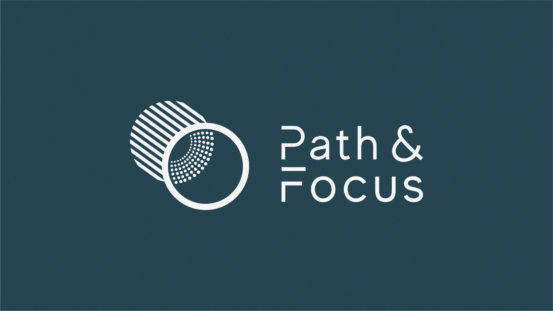
Path & Focus
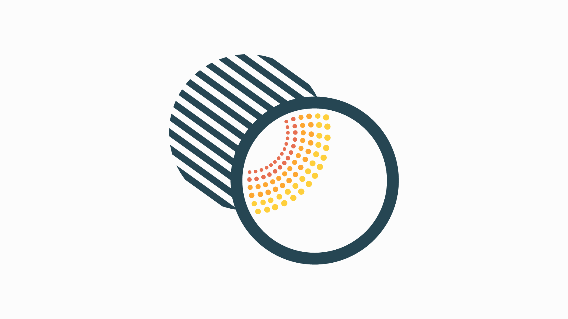
Path and Focus is a Wildfire Technology Company that develops software to collect and analyze data to determine the wildfire risk in an area.
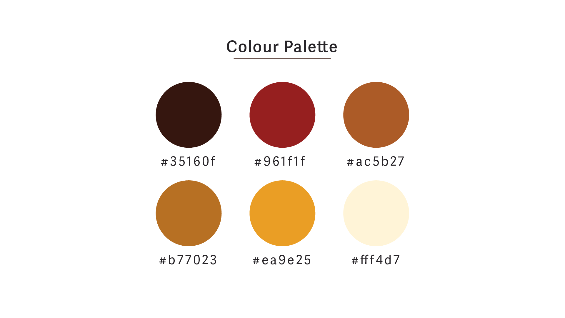
The logo portrays a sense of movement (path) and a deeper look at data visualization (focus). We wanted the colors to convey trust and cutting-edge technology, while emphasizing a connection to wildfires.
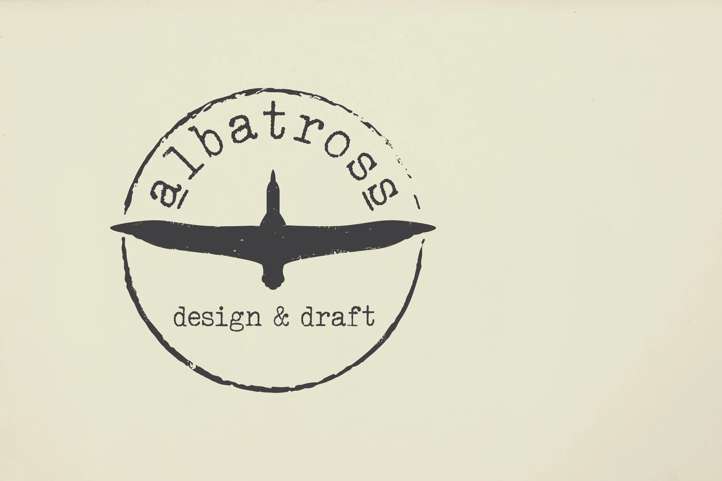
Albatross Design and Drafting
Albatross Design & Drafting is driven to create unique and purposeful buildings that are economically and socially conscious.
The client wanted a logo that would portray an organic, hands-on approach to drafting and design. The solution we arrived at was a rustic stamp that was simple in design, and would reproduce easily across all kinds of media.
Thompson Rivers University
The Department of Environment & Sustainability at TRU aims to bring positive environmental changes through the actions of the university.
This logo was an abstract take on the idea of living in harmony with the earth and giving back to nature.
Reach Out.
Are you in need of a logo for your new business? Perhaps it’s time for an upgrade and redesign on your existing logo. Get in touch and we can figure out the right course of action for you and your brand.